Voices of Music
Website redesign | Client work
Overview
Voices of Music is a non-profit 501(c)(3) organization and the most popular early music ensemble in America. It produces live concerts and has a robust collection of video recordings on a YouTube channel with over 260,000 subscribers. In addition, they provide early music education and outreach programs. I was hired to design and code their new website.
Key deliverables: High-fidelity mockups, website code
Duration: June 2021 – August 2021 (3 months)
Team/Role: Independent web design and development
Tools: Figma, Visual Studio Code
The Starting Point
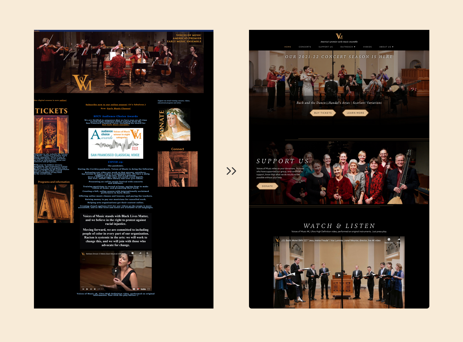
The original website was difficult to navigate and numerous pages were missing content. Additionally, text was often hard to read because of unusual layouts. My goal was to make the website overall easier to navigate and understand.

Research
Competitive Analysis
I looked at three other arts organizations, The Metropolitan Opera, the Royal Opera House, and the New York Philharmonic Symphony. Some observations:
- Prioritizing information about concert offerings
- A separate introductory “Support Us” before the “Donate Now” page
- Simple, streamlined layouts to organize a lot of information
Information architecture
The directors of Voices of Music wanted the website to highlight three key actions in their audience:
- Buy concerts tickets
- Donate money or other resources
- Learn about the organization's outreach programs
I made three key changes to achieve these goals.
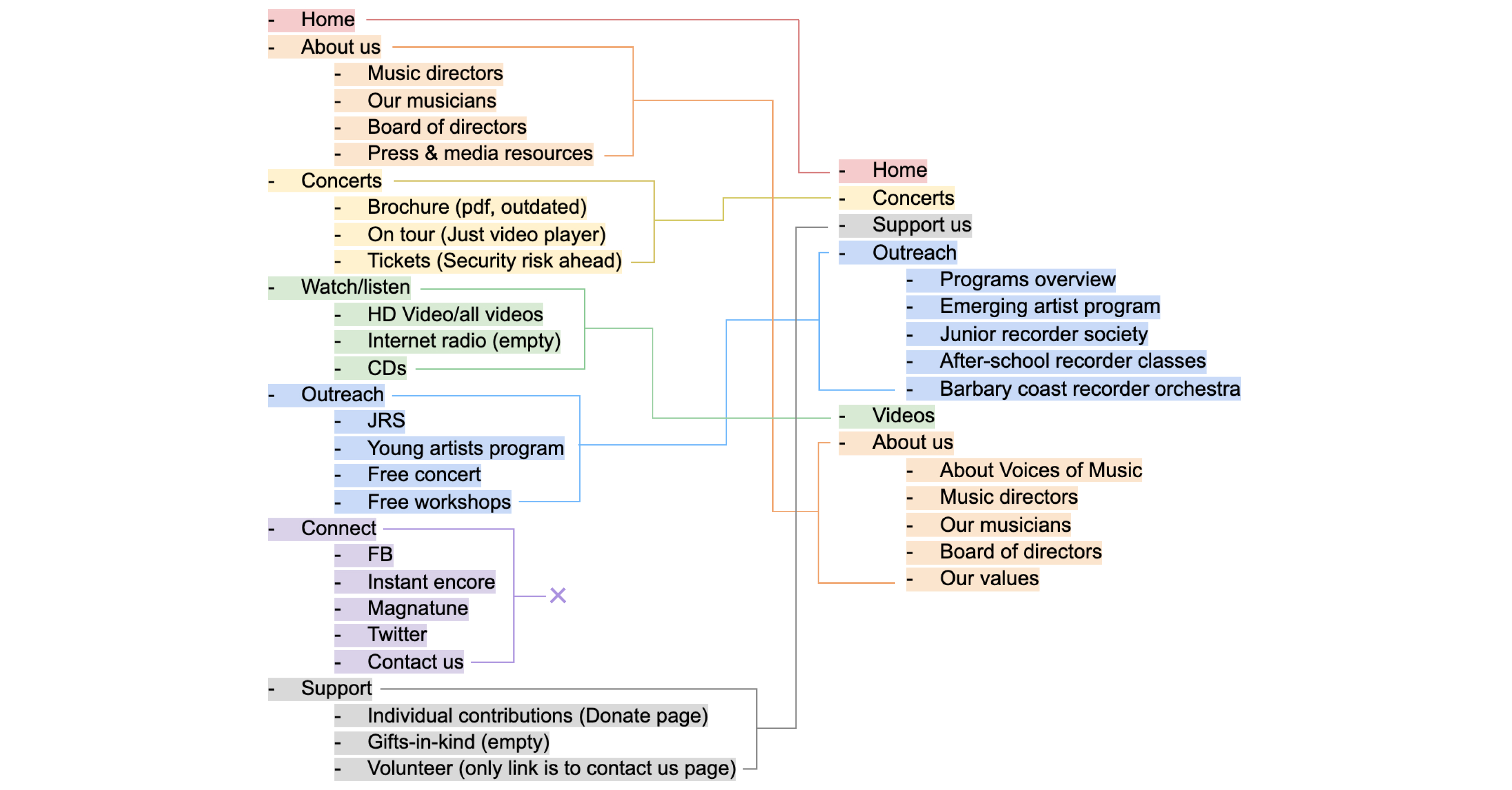
Combining and creating pages
The addition of a footer eliminates the need for a “Contact Us” page. Small or obscure pages like “CDs” and “Gifts-in-Kind” were also combined with other pages, while new pages like “Our Values” provided crucial information about accessibility and other topics.
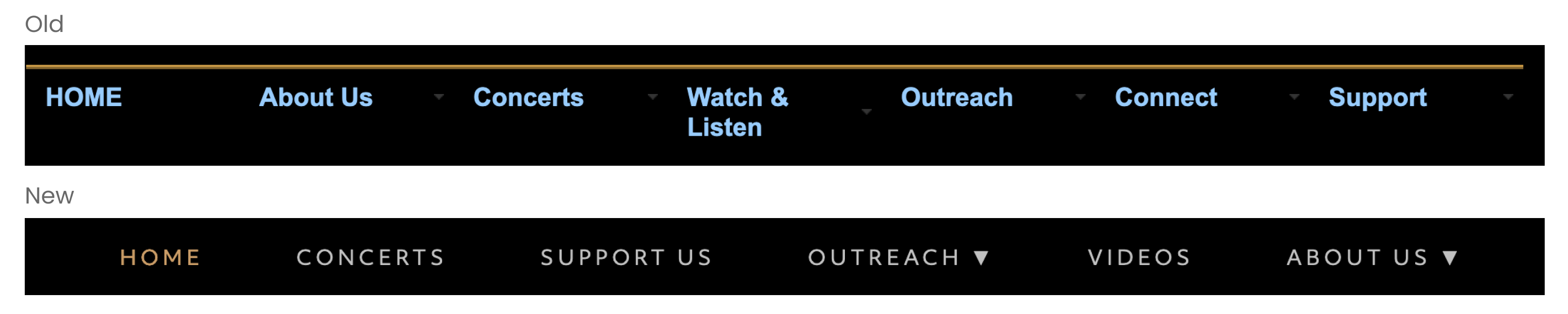
Navigation bar
The new menu, now consistently visible, is ordered with the most important actions first.
Home page layout
Tiles that span the entire page width help focus users on different topics rather than forcing the eye to jump around the page. The topmost tile also emphasizes concerts and gives users a more appealing image of what the experience will be like.
Ideation
I sketched out some ideas for various pages, with some color to identify the amount of space different sections occupy.

Development
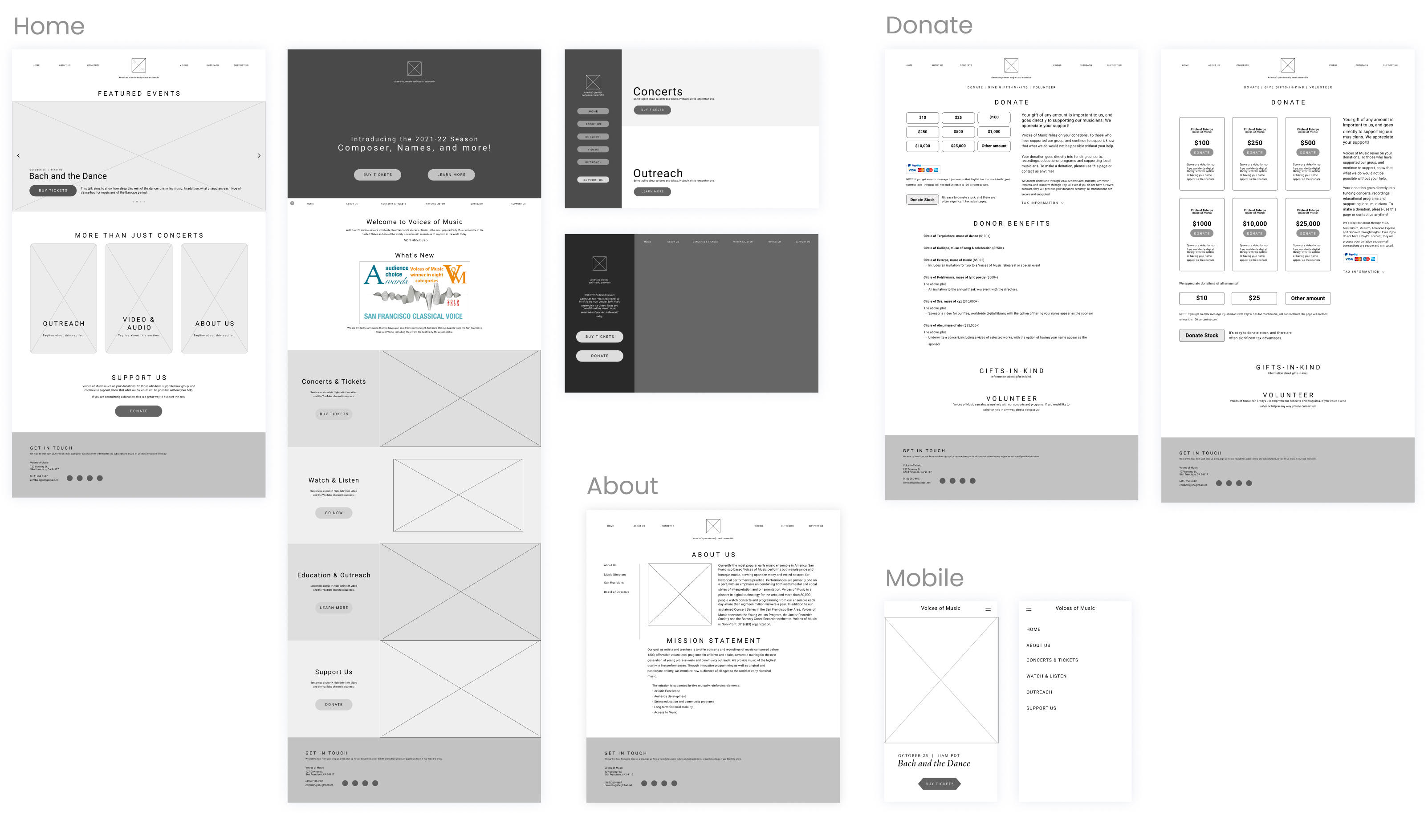
Low-fidelity
My focus with the project was more on functionality, so I did not try to rebrand their website. Rather, I wanted to make it easy to scan and read. I gave all pages the standard format of a banner image followed by a centered column of text. Keeping their dark mode aesthetics, I chose a gray for the text that would be easier on the eyes, and adjusted font size and spacing so that long text would not be as overwhelming.
Medium-fidelity
From the low-fi ideas I sketched out, I created wireframes in figma, and slowly advanced them to full prototypes while collaborating with the directors to ensure we were all happy with the final outcome.

High-fidelity
Visit voicesofmusic.org to view it in action.

Reflection
Organization for a bigger project
This was the first website I’ve designed with more than two complete pages. In designing this website, I learned how to organize a workflow with numerous files and page layout ideas.
More complete prototypes
I have a bad habit of jumping into coding when I’m not yet happy with the prototypes. This led to the complete scrapping of one page’s code, which took hours to complete. I’m learning the discipline to stay focused on visual design even when I’m feeling stuck rather than pivoting to a different, less creatively challenging task.
Timelines for working collaboratively
As an independent, remote, asynchronous project, I had some delays with organizing meetings with the directors. This taught me the importance of a pre-planned timeline with deadlines and scheduled meetings to help meet goals.