Divide
UX/UI case study | Personal project
Overview
Key deliverables: Slide deck, high-fidelity mockups
Duration: February 2021 – May 2021 (3 months)
Team: Independent
Tools: UX research, Figma
Defining the problem
🤔 How might we help people make the most of their free time?
College students are cruched for both time and energy. People want to make use of free time for a fun activity, but often end up spending that time on social media and regretting it.
Spending time on social media is not a bad thing, but many people feel addicted to social media and do not feel in control of where their time goes.
Research
User interviews
I interviewed 3 undergraduate students from 3 colleges, all 19-20 years old, about how they spend their free time and what they want to change about it.
Key insights
🥱 “I don’t even enjoy social media, it’s more just something I do.”
All interviewees complained about social media, saying they spend time on social media not because they really enjoy it, but because it’s easy. They want to go on social media less.
😈 “Getting started [on a hobby] is the hardest part. It’s like you have the devil and angel on your shoulders.”
Habits are hard to change, especially with limited energy. People want to change and take abstract actions, but there is a discrepancy between desire and discipline.
User personas
🧗 Mara, 19
- Goals
- Self improvement
- New experiences and skills
- Background
- Lots of free time
- Many hobbies and interests
- Doesn't always have the time to try all the new things she wants to do
📚 Ron, 20
- Goals
- Focus on academics
- Find healthier work-life balance
- Background
- Procrastinates a lot, so he's often stressed during free time
- Doesn't have many hobbies
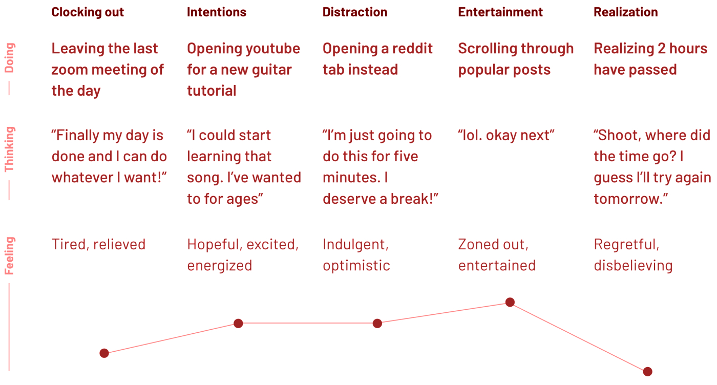
Journey map
Ideation
I came up with 10 preliminary ideas.
📝 To introduce new hobbies: A pass/no pass class introducing people to different hobbies, with homework assignments of spending time on them.
📅 To make time easier to visualize: A “pixel-a-day”-inspired calendar that can be used to track hours spent on hobbies, and see where your time really goes.
⚠️ To limit social media use: A browser extension that has popups every so often on distracting sites, in an attempt to dissuade users from continuing on them.
Development
I went forward with the last idea because it seemed like the least effort for users, and targeted a problem that users expressed the most frustration with, social media.
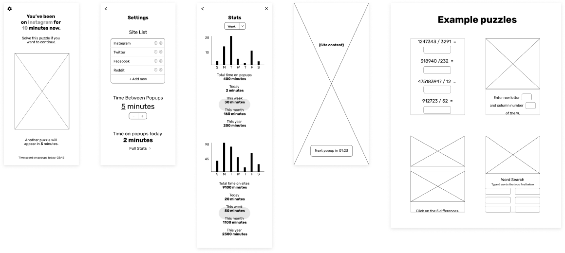
Low fidelity

Medium fidelity
Usability testing
After having people interact with my prototype, these are some of the changes I made:
👫 Friends
Users can see friends’ statistics. This is a strong motivator to reach time goals, since they users now have people to keep them accountable
📊 More extensive statistics
Users get more valuable information from the stats page, like the recommended number of hours to spend on sites and the averages across all users. This helps them set realistic goals.
➗ Problems, not puzzles
Some users thought the idea of a mix of puzzles was too fun, so I changed them to all be tedious division problems. With each consecutive popup, the number of problems increases.
Final solution

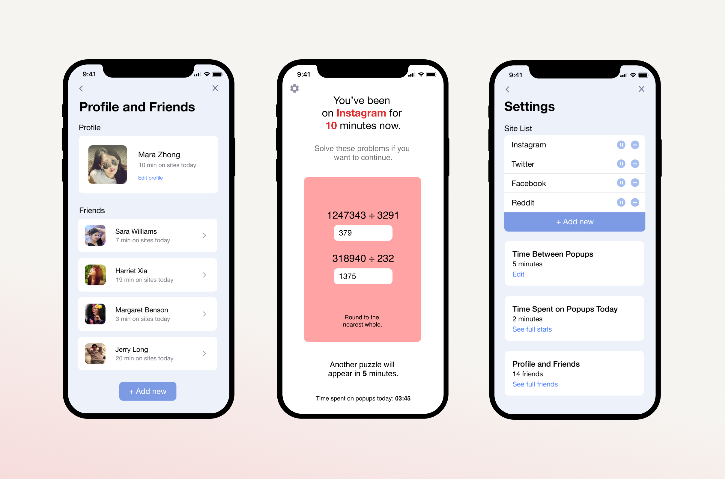
A countdown timer is constantly on the screen to remind users that a popup will soon appear. The popup tells the user how long they've been on the site, and presents a division problem.
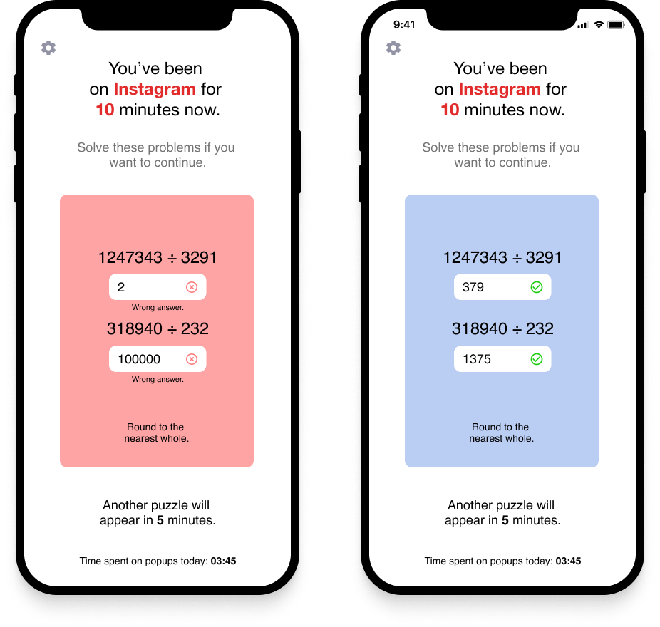
Simple yet accessible visual cues provide feedback on whether or not the solution is correct, and the user can return to what they were doing.
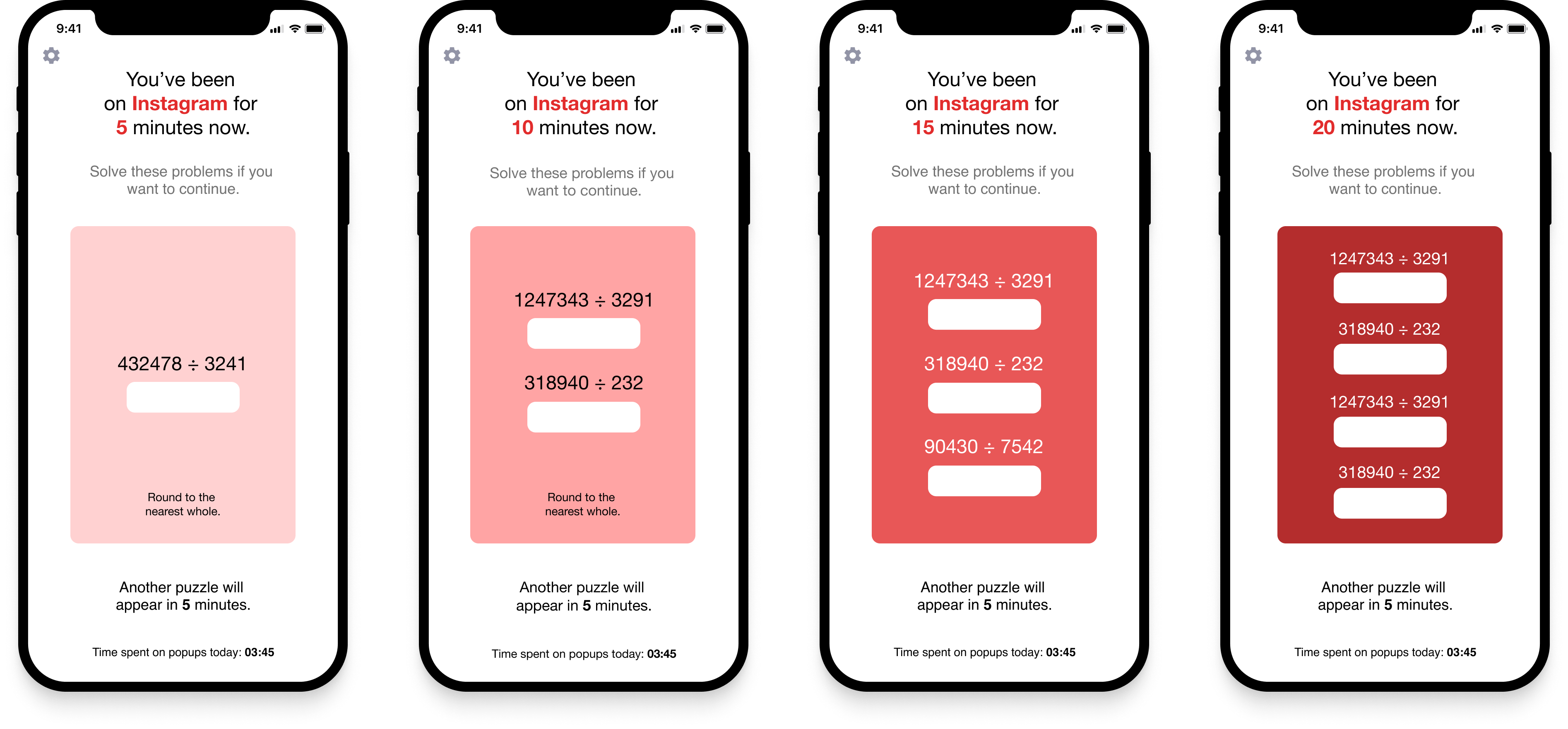
Each time the popup appears, it includes one addition division problem and is a darker shade of red. The longer users are on a site, the more they have to work to continue using it. This also stops them from becoming used to the level of inconvenience of the popup, since it takes longer to complete each time.
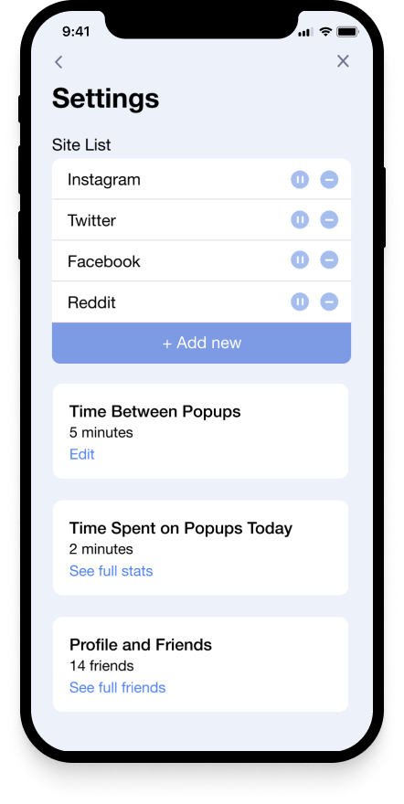
Users can easily edit the list of sites that receive popups, including pausing popups on certain sites. They can also edit the amount of time between popups and other details.

Users can add friends and view their friends' statistics. Under their own profile, they can also edit privacy settings if they don't want others to view their statistics.
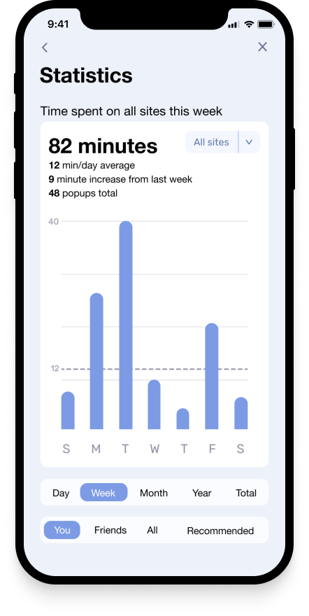
Users can view extensive statistics of their own time use, and compare it to that of their friends, recommended use, and the average of all users of this extension.
Reflection
📱 App integration
For this concept to properly work on iPhones, it would have to be integrated into apps like Instagram and Facebook in some way. More research is needed to find out how much engineering lift would be needed for this to actually work.
🛌 Not everything is about productivity
While many people want to do more with their free time, it's still important to keep in mind that social media can be comforting and help people unwind. Hobbies are fun, they're still not worth burn out if what you really need is rest.