Twitch Internship (Amazon IVS)
Product design | React
Overview
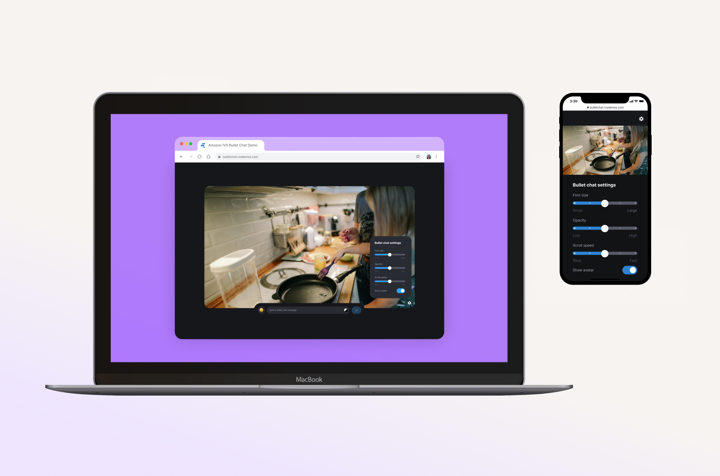
Twitch works using Amazon IVS, a live interactive video streaming service that also allows other companies to build and run their own live streaming platforms. Many customers want to use IVS to build bullet chat, a type of chat in which messages scroll across the screen. My internship project was to design, prototype, and build a bullet chat demo using IVS.
Key deliverables: Working demo, high-fidelity mockups, code samples, presentation
Duration: June – August 2022 (3 months)
Team/Role: Independent, managed by Maxime Boulin, mentored by Sang Lee
Tools: UX research, Figma, Visual Studio Code
Background
Context
Amazon IVS is a live interactive video streaming service that also allows other companies to build and run their own live streaming platforms. The IVS Chat product, released earlier this year, is popular among our customers.
The Problem
Many customers want to use IVS to build bullet chat, a type of chat in which messages scroll across the screen rather than being contained on the side, as pictured in the gifs below.


The problem is that it’s not immediately clear how IVS can be used to do implement this kind of chat, design-wise or engineering-wise.
My Role
My project was to design, prototype, and build a bullet chat demo using IVS. The outcome of this project was code published open source on github and a demo to be hosted on ivs.rocks, which also hosts other demos created by my team. This is available for customers to use on their own, and to our sales team when they present to customers.
Design Process and Goals
Before starting, I did research on existing bullet chat implementations on sites known for bullet chat like BiliBili and Niconico. I also tried out extensions that add bullet chat to Youtube and Twitch. Once I started designing this demo, I had some constraints and goals in mind.
Overall, I was creating a responsive, self-contained bullet chat app demo that works on both desktop and mobile.
- It had to be simple, so that it highlighted the key actions of sending bullet chat messages and watching them scroll across the video.
- It also needed to be engaging and delightful, so users enjoy using it and see that bullet chat is fun and worth implementing
I started by sketching out possible layouts and brainstorming different features and functions I wanted it to have, keeping simplicity, engagingness, and delight in mind.
Final Mockups
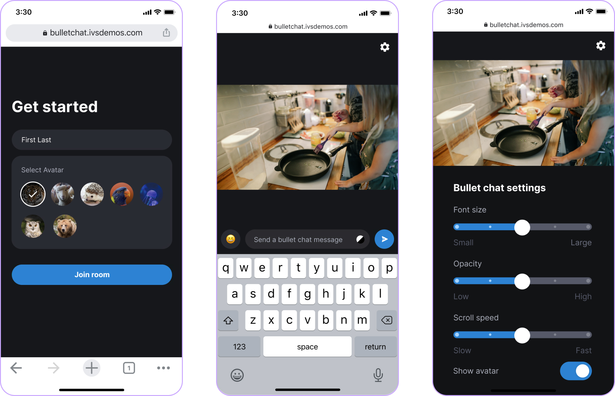
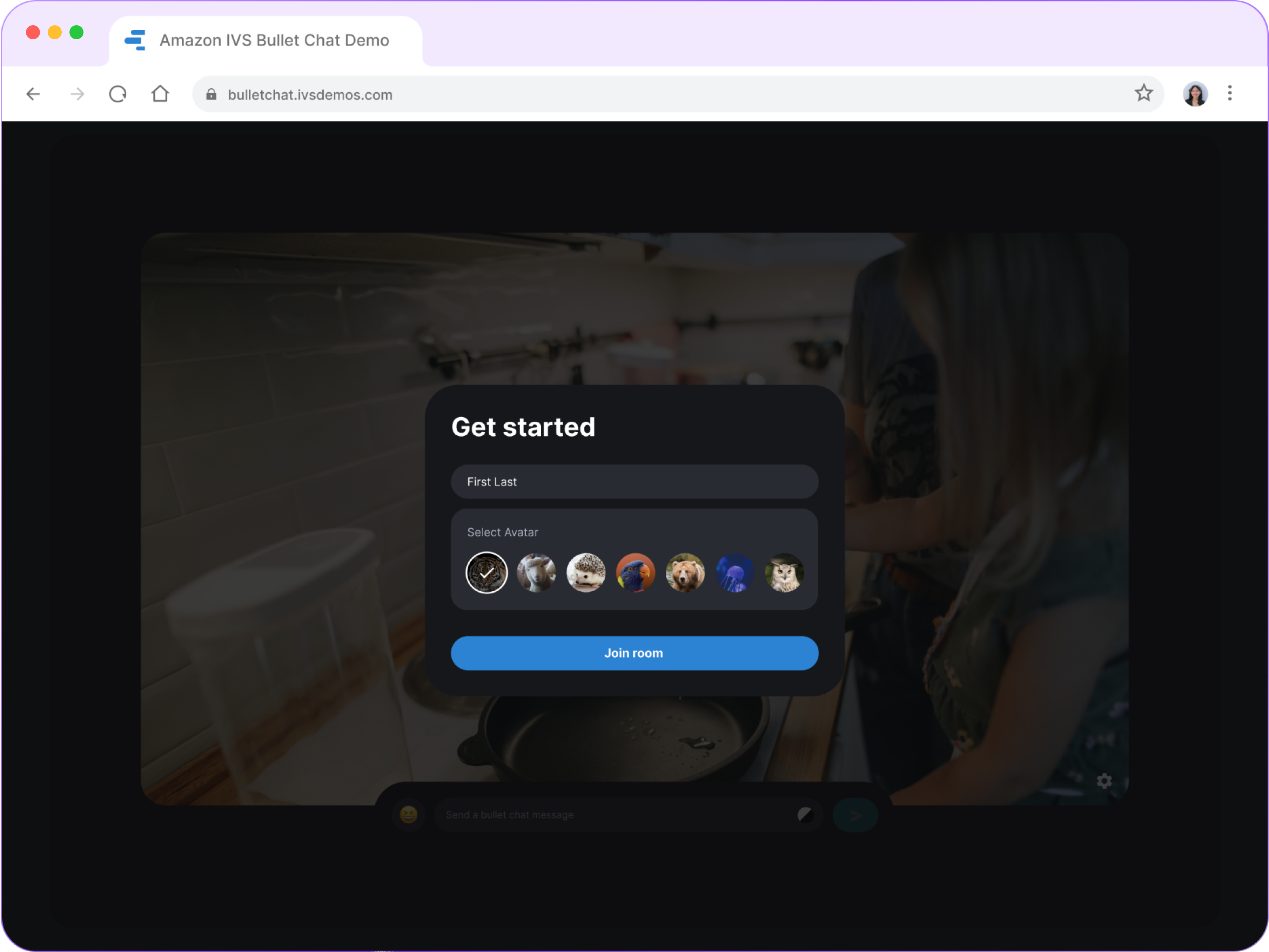
I created mockups on figma and went through several rounds of design reviews with my team to get feedback and iterate on that feedback. These designs were my guide when coding the demo.


Walkthrough
Finally, I used React to code a working demo. Scroll to see it in action, or go to bulletchat.ivsdemos.com to try it out yourself!
Enter your name to join the room
Type in and send bullet chats
Send emojis with the click of a button
Toggle between normal and fancy messages
Adjust the settings of how you want messages to be displayed
Resize your window and see the demo's responsiveness
Key Takeaways
👤 Always keep the user in mind
Initially, I kept trying to design for the user of an actual bullet chat app. I later realized I should be designing for the users of this demo specifically—customer companies and their developers, who need to be able to picture themselves building something like this, and our sales team, who need to feel empowered to use the demo.
🐱 Stay curious
I had never heard of bullet chat even though it’s huge in other countries and I find it to be a really engaging experience. I want to continue exploring to keep up with new trends and also learn about things that have been around but just haven’t been on my radar.
🏗️ Design doesn't end at the mockups
This project was a good reminder that design goes beyond just making static mock ups and sending them to engineers. Interactivity is a big part of how it feels to use the product, and that’s found mainly in how the design is implemented. I’m happy I was able to go from envisioning something to fully realizing it and publishing it